

This article was written by Cameron Pavey, a full-stack dev living and working in Melbourne. Scroll below for this picture and bio. As a developer, it is likely that you will eventually run into a situation where a traditional relational database’s document stores don’t quite cut it. If you need to store points of data over time, you’ll likely need a time series database.
Aggregations are a powerful tool when processing large amounts of time series data. In fact, most of the time you’re going to care more about the min, max, mean, count or last values of your dataset than you will about the raw values you’re collecting. Knowing this, InfluxDB and the Flux language make it as easy as possible to run these aggregations, whenever and wherever you need to, and sometimes that leads people to running them in ways that aren’t as efficient as they could be.
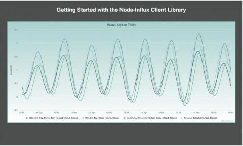
If you’re building an IoT application on top of InfluxDB, you’ll probably use a graphing library to handle your visualization needs. Today we’re going to take a look at the charting library, Highcharts, to visualize our time series data with InfluxDB Cloud. However, I also encourage you to take a look at Giraffe, a React-based visualization library that powers the data visualizations in the InfluxDB 2.0 UI.
As the Industrial Age Army transforms to the Information Age Army, Army leadership recognizes the need for adaptable technologies that enable data exchange at the tactical edge. Not only must these technologies be in lock step with the 8 guiding principles of the DoD Data Strategy, but they must also deliver on the Army’s data imperatives of speed, scale and resilience.