In my prior two blog posts, we focused on creating a bunch of Enterprise Applications (EAs), tagging those EAs, and then updating the Status dashboard to only show those EAs that are Critical Service Offerings (CSO). For this blog post, we will create some relationships and demonstrate how alerting behaves using SquaredUp's Manual Reporting Availability functionality available in the EAM tier of the product. For this post, we're going to do amazing stuff!
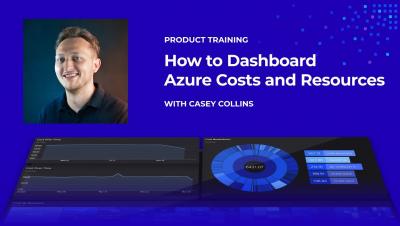
Are you suffering from overspending in Azure, lack of cost visibility and lack of context? You’re not alone; Azure cost management is a problem we hear about time and time again. That is why we created top-notch cost tiles that would allow users to build the perfect Azure cost dashboard, and help them quickly identify overspends and expensive resources in their Azure tenant.
In my last blog post, we focused on creating 29 Enterprise Applications (EA). We also spent some time talking about our Critical Service Offerings (CSO) and Supporting Service Offerings (SSO). And finally, we looked at three out-of-box dashboards. If all you needed was to create a dashboard to control the boxes’ color quickly, you already have what you need.
As part of my job as a tech evangelist and a pre-sales engineer here at SquaredUp, I often find myself talking to a lot of people. And understandably, when you as a consumer are trying to evaluate a product that you may potentially invest in, it’s only natural that you want to compare different products and decide which one’s better and/or offers more value for money and why.
We are thrilled to announce that among our other big plans for 2021, we have migrated and upgraded our much-loved Community Answers platform! It is now a lot easier to connect with the rest of the monitoring community and get the answers you are looking for.
In my position, I get to work with a wide variety of organizations that each have a different level of monitoring maturity. But I’ve noticed an emerging pattern that I’ll call the ‘Critical Service Offering’ or ‘Executive Level Status’ dashboard. At their most basic level, these dashboards should communicate the current health of the application, provide some historical context and, most importantly, not be tied to infrastructure monitoring.
Yup – we've now got a health explorer for Azure VMs! Health Explorer… now why does that sound familiar? You’ve probably guessed it by now, but here’s another hint: Hmm…now where have I seen that before? Right – in SCOM!