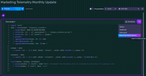


So you’re interested in time series databases, and you decided to explore InfluxDB Cloud or InfluxDB v2. Perhaps you just created a free account or downloaded the binary, and now you’re playing around with the InfluxDB User Interface (UI) and learning Flux. The hardest thing for beginners to understand are the return results from a Flux query or Annotated CSV.
Adding annotations to your data is a great way to share context with other members of your team. In May, we added the ability to annotate individual points in your data. Today, we have added the ability to add ranged annotations to your dashboard graphs. We’ve also reworked some of the interactions with annotations based on user feedback so that they can be added quickly and easily. To learn more about working with annotations, check out our documentation.
GitHub Actions are a powerful way to add automation to any source code repository. When you take that power and connect it with InfluxDB, you get an amazing combination that allows you to automate data generation, manage GitOps workflows, and a whole lot more. This post will highlight some of the interesting ways to use InfluxDB and GitHub Actions.
We recently introduced a new Map graph type into InfluxDB Cloud to help users visualize time series data that includes position. Above is a graph showing the most recent earthquakes in California, where the color of the marker indicates their magnitude. In this post, I’m going to walk through the ways to ingest geotemporal data into InfluxDB Cloud, and how to use the new Maps visualization type.
When learning a new technology stack or language, access to good documentation, tutorials, and support is critical to lower the barrier to adoption and enable users to take advantage of the tools themselves. At InfluxData, we support our users by providing the following resources. Searching through all of these resources and more, like GitHub issues, can be time-consuming and difficult. In response, the support team at InfluxData has recently created InfluxData Support.
InfluxDB Cloud offers a transparent usage-based pricing model that only charges users on the work performed, with no minimums or long-term commitments. This puts YOU in charge of what you spend. However, with four separate pricing vectors, it’s not always easy to see exactly where that cost is going, or how to estimate your potential spend based on your data usage.
So you’re using InfluxDB Cloud and you’re taking full advantage of Flux to create custom data processing tasks, checks, and notifications. However, you notice that some of your Flux scripts aren’t executing as quickly as you expect. In this post, we’ll learn about best practices and tools for optimizing Flux performance.
Last year I started an IoT project, Plant Buddy. This project entailed soldering some sensors to an Arduino, and teaching that device how to communicate directly with InfluxDB Cloud so that I could monitor those plants. Now I am taking that concept a step further and writing the app for plantbuddy.com. This app will allow users to visualize and create alerts from their uploaded Plant Buddy device data in a custom user experience.