

New in Grafana 10: A UI to easily configure SAML authentication
In addition to the built-in user authentication that utilizes usernames and passwords, Grafana also provides support for various mechanisms to authenticate users, so you can securely integrate your instance with external identity providers. We are excited to announce that with the release of Grafana 10.0, we have introduced a new user interface that simplifies the configuration of SAML authentication for your Grafana instances.

Four reasons to try our next-gen dashboards
When you need to troubleshoot faster, rich out-of-the-box content lets you easily monitor the tools in your technology stack. Dashboards are key to our customers’ success — offering you deep insights at a glance and the ability to drill into the details most important to you. A couple years ago, we debuted a new style of dashboards, built on top of a scalable, flexible and extensible charting system.
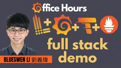
OpenTelemetry demo app with Grafana, Loki, Prometheus, Tempo (Grafana Office Hours #06)
DevOps Engineer Blueswen Li 劉義瑋 joins us to walk us through some OpenTelemetry demo apps he created, instrumented with Grafana, Loki, Prometheus, and Tempo. He is joined by two of our Developer Advocates, Paul Balogh and Nicole van der Hoeven.

5 steps to start saving on your observability bill with Grafana Cloud Adaptive Metrics
In the observability space, it seems like everyone is talking about how to reduce costs and control the explosion of Prometheus metrics. It’s no wonder — our recent analysis of user environments suggests 20% to 50% of metrics generated are never used, but users are still stuck paying for them.

Using An Infrastructure Monitoring Dashboard
As businesses embrace more cloud-native technologies and IT infrastructure becomes more dispersed, they must connect their business goals and end-user experience with the availability and performance of their IT infrastructure. This change necessitates infrastructure monitoring to assure compatibility with cloud environments, operating systems, storage, servers, virtualized systems, and other components.

Jira Product Discovery Explained
Maidenhead Atlassian Community Event (ACE) are joined by Rina Nir of Radbee and Phill Fox of Adaptavist for a closer look at Atlassian's newest product - Jira Product Discovery which claims to make it easier to prioritize ideas and create roadmaps for Product Managers. Rina and Phil put it to the test, show us what it can do, and share tricks and tips to get the most from it.

Lessons learned from integrating OpenAI into a Grafana data source
Interest in generative AI and large language models (LLMs) has exploded in popularity thanks to a slew of announcements and product releases, such as Stable Diffusion, Midjourney, OpenAI’s DALL-E, and ChatGPT. The arrival of ChatGPT in particular was a bellwether moment, especially for developers. For the first time, an LLM was readily available and good enough that even non-technical people could use it to generate prose, re-write emails, and generate code in seconds.

What on earth are DORA Metrics?
If you take a glance at LinkedIn, Twitter, or any tech-focused social content these days you're bound to see people talking about something called "DORA metrics". So what are DORA metrics? What value do they provide? And how can you get started with them?