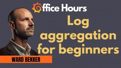
Dashboards

Get ServiceNow data alongside SCOM, Pingdom and more

For those on an ITIL journey, ServiceNow appears to be the service to beat. ServiceNow has tremendous flexibility and thousands of different workflows to support your business. And if you’re using SCOM to populate your CMDB, you’re leaps and bounds ahead of the average organization. Sadly, that flexibility comes with the cost of being stuck inside of the ServiceNow web interface.

Analyzing Elastic Workplace Search usage in a Kibana dashboard

Let’s start off with some good news: since 7.9.0, your Elastic Workplace Search deployment has been collecting and logging product usage data for you and your team. Usage data like, what your users are searching for, what links they're actually clicking on, and which searches are falling short. And better yet, in a future release we’ll be putting a prebuilt Workplace Search analytics dashboard at your fingertips in Kibana, one of the most powerful visualization tools available.

We built LogDNA Templates so you don't have to

With an ever growing list of infrastructure improvements, new features, and issues to debug, setting up your observability tools to keep up with best practices can fall down your list of priorities. There’s simply not enough time to set up new dashboards that can give you the visibility you need to be proactive with your infrastructure.

SquaredUp 5.0 is coming And it will be bigger and better than ever before!

As the year draws to a close, we’ve got exciting news. In the new year, we will be launching SquaredUp version 5.0! So, what exactly is in this big, bold update, you ask? Expect a gorgeous new look and feel plus major improvements to our two most popular features – Open Access and Dashboard Designer. We’re also bringing you even more visualizations for your Web API integrations, so you can display data in the best possible way in your single pane of glass. The best part?

Why SCOM needs SquaredUp: Performance monitoring reporting

As a SCOM admin, you’re probably heavily involved with alert analysis and performance monitoring. You probably also know then, that while SCOM is a great monitoring tool, it leaves a lot to be desired when it comes to reporting on performance monitoring. I’ve got good news for you. SquaredUp sits on top of SCOM and completely changes the game. How? Why? Read on for a comparison and break down of all the reasons you should do it with SquaredUp.

Driving dashboard actions in Kibana with URL drilldowns

With the release of Kibana 7.10, dashboards have gained a powerful new feature: URL drilldowns that let you instantly click into any predefined webpage from a visual in a dashboard. Now you can build Kibana dashboards that provide data-driven insights and allow direct actionable paths to the systems you use every day. To learn more about URL drilldowns, be sure to join us for the upcoming webinar, How to build dashboards that drive insight and action in Kibana.

The observability market is heating up, but is it more than just hype? Industry watchers weigh in

The observability market is undoubtedly hot. Consider the headline-grabbing evidence: multiple IPOs, hundreds of millions of dollars in venture capital funding for startups, and huge market caps of vendors playing in the space totalling more than $80 billion. Still, it has to be asked: Is all the hype warranted, or is this really just “absurdability”? We asked seven industry watchers to weigh in.

Barbara Nelson | How Can I Put That Dashboard in My App? | InfluxDays

Many users love using the InfluxDB UI to visualize their time series data in a variety of different graphical representations. In this session, Barbara Nelson will show how to use Giraffe (the React-based visualization library powering the data visualizations in InfluxDB 2.0 UI) to visualize your time series data within your own app. You can bring the power of our visualization tools to your users, directly in your app, instead of requiring them to login to the InfluxDB UI to see a visual representation of your data.