
Create Customized Dashboards for End to End Visibility Over Your Entire Network
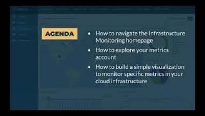
With employees scattered into an assortment of different IT environments, it can be a challenge to keep track of all the data you’re receiving from your various monitoring platforms. Using dashboards to sort and filter potential action items is an essential need of efficiently using they resources you have. In this #ITConnections session we will go over some of the best practices to creating dashboards that will effectively handle your business.