Dashboards

Grafana 9.4 release: Easy data source setup, custom panels, Grafana Alerting updates, and more

Grafana 9.4 is here! Get Grafana 9.4 With the latest Grafana release, we’re introducing a wealth of new features and improvements that makes getting started with Grafana even easier and that take your visualizations and observability best practices to the next level. In addition to enabling TraceQL, the new query language for distributed tracing in Grafana Tempo 2.0, for all Grafana Cloud users, the Grafana 9.4 release comes with a fresh round of features.

Instrumenting Node.js code with Prometheus custom metrics

Automatic instrumentation is great, but to get the most out of your monitoring you often need to instrument your code. In this article I am going to explain how to instrument a Node.js express app with custom metrics using the Prometheus prom-client package. Although this article specifically addresses Node.js and express, my hope is that the general concepts are applicable to other languages too.

How Siemens Mobility is moving its trains into the future with Grafana Enterprise

Railway passengers may think of trains simply as a way to get from one place to another, but at Siemens Mobility — a rail transportation company dedicated to delivering sustainable, smart transport — they are that and much more. Siemens Mobility works with more than 3,000 partners, and its customers include Eurostar and Trans Pennine Express. In the U.K., Siemens Mobility maintains about 500 train units and logs 65 million passenger miles per year.

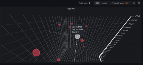
Introducing the XYZ chart: A three-dimensional way to visualize your data in Grafana

This panel is in alpha version and still in development. To use it as is, you need to modify your configuration file and set enable_alpha = true in the panels section. More information can be found on this page. Two-dimensional graphics are the de facto way to visualize data within the observability realm, and Grafana is really good at plotting data this way.

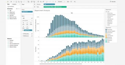
7 Best Practices for Data Visualization

A look at best practices, no-code and low-code platforms you can use, common visualization types, criteria for good data visualization and more. Organizations regularly generate an overabundance of data that is essential for decision-making. Data visualizations play an important role in helping people understand complex data and observe patterns and trends over a period of time.

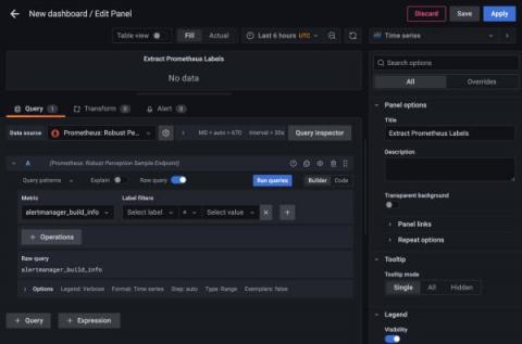
How to extract label values from Prometheus metrics in Grafana

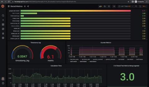
Prometheus metrics are usually visualized as numeric values on a graph, with the metrics categorized by labels. But what do you do when the numerical value doesn’t matter, and all of the information is in the labels? In that case, you might need to visualize the labels themselves. This scenario can arise because you’re not always in control of how the metrics get reported, but you do often need to visualize what’s there.

Best Practices for Our Custom Dashboards

Custom dashboards are essential tools in the data-driven world for businesses, organizations, and individuals. They provide an interactive and comprehensive representation of data, making it easier to identify trends, patterns, and outliers. Custom dashboards are highly customizable, allowing users to select the most relevant data sources, visualizations, and metrics to meet their specific needs.

How Wells Fargo modernized its observability stack with Grafana Enterprise and Grafana Cloud

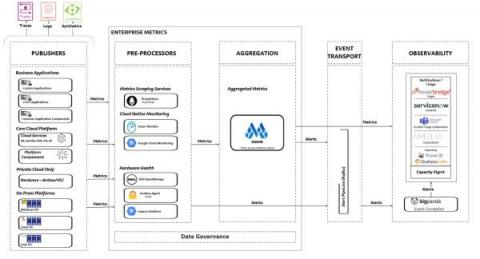
Think of a monitoring tool — any monitoring tool. Got it? Good. Odds are, whatever came to mind was probably being used behind the scenes at Wells Fargo not too long ago. “You name it, and we probably had it at Wells Fargo,” said Senior Software Engineering Manager Nikhilesh Tekwani of the complex web of observability solutions that stretched across the U.S.-based financial institution.

10 Best Grafana Alternatives

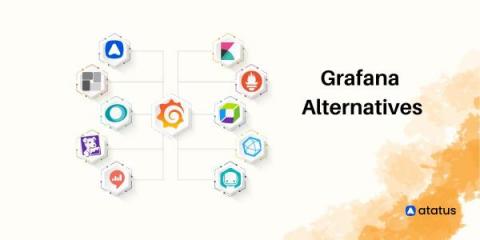
Grafana is a powerful open-source data visualization platform created by Torkel Ödegaard in 2014. With its front-end written in Typescript and a Golang back-end, this data monitoring platform allows users to create and share interactive and dynamic dashboards with custom charts and panels using data from various sources, including InfluxDB, Prometheus, Elasticsearch, and many others. Template variables are also available as dropdown options to create dynamic and reusable dashboards.

How to Create a Dashboard in Kibana

Wondering how to create a dashboard in Kibana to visualize and analyze your log data? In this blog post, we’ll provide a step-by-step explanation of how to create a dashboard in Kibana. You’ll learn how to use Kibana to query indexed application and event log data, filter query results to highlight the most critical and actionable information, build Kibana visualizations using your log data, and incorporate those visualizations into a Kibana dashboard.