Dashboards

How Banco Itaú tracks 1.5B daily metrics on-prem and in AWS with Grafana and observability

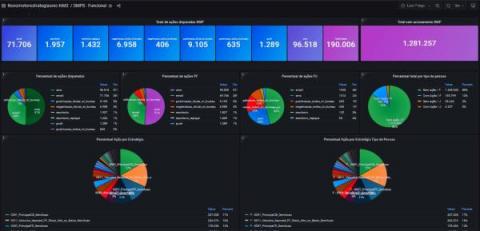
Brazil’s Banco Itaú is the largest bank in Latin America, so when performance and uptime issues impact its applications, the reverberations can be massive. “It can impact the whole economy of Brazil. It can damage other banks’ business too,” Ana Paula Genari Martin, SRE manager at Banco Itaú, said in her recent ObservabilityCON talk. And keeping those applications running is no small feat, considering the size of their digital operations.

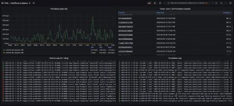
Seeing vs. Understanding - The Power of Trace Visualization

It’s common in our everyday language to conflate seeing and understanding when the two are actually very different things. For example, if every day for the last few years we spoke briefly and wrote down the total number of Covid cases in the world, it would be easy to see some trends in the data—you would see the data. But if we present the same data drawn as a chart, it’s easy to understand where the spikes and dips are and when the situation got really bad.

Building AppStack Dashboards

AppStack™ helps you diagnose and troubleshoot performance problems faster—from applications to servers, virtualized infrastructure, databases, and storage systems. The AppStack dashboard shows you all performance information across the application stack with relationships between various elements of your environment. Kevin M. Sparenberg, SolarWinds THWACK Community Evangelist, shows you how the dashboard works and why it’s so important for troubleshooting application issues in your IT infrastructure.

Grafana crosses 1 million mark for active instances

It’s hard to think of a use case that Grafana hasn’t been used for. When Torkel Ödegaard launched the Grafana open source project with his first commit in December 2013, “my goal was to make time series data accessible for a wider audience, to make it easier to build dashboards, and to make graphs and dashboards more interactive,” he said.

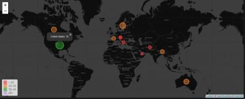
Grafana Worldmap Panel

Grafana Worldmap is a free-of-cost panel used to display time-series metrics over a world map. Users can choose to visualize their data based on cities, states, countries, or any other segregation they like as long as they have a coordinate for each data point. Each data point comes in the form of circles that vary in size depending on the value of data and can get color-coded as per thresholds.

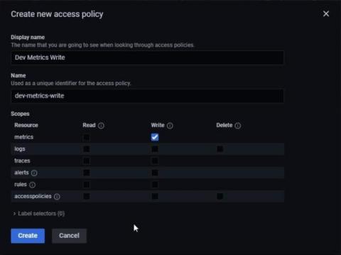
Grafana Cloud Access Policies: Say hi to the new Cloud API keys

Until recently, Grafana Cloud users had to rely on API keys to read and write data to and from the composable observability platform. These API keys had minimal features, which limited administrators’ ability to manage account access on a granular level. We’re keenly aware of these shortcomings, and we’ve been working to overhaul and replace these API keys with something more flexible, more reliable, and more secure.

Have fun again creating! Get to know visual console and dashboard editing

Did you know that the visual console editor allows users to design the final look by dragging elements with the mouse? You just have to choose the background and icons that represent the status of each relevant aspect you want to display. We tell you this and much more in the video on our workshop.

How Grafana unites Medallia's observability stack for faster, better insights

California-based Medallia captures feedback signals — in-person interactions, customer surveys, call centers, social media, etc. — to help businesses improve their customer experience. In much the same way, the company’s Performance and Observability Engineering team captures observability signals to optimize the experience for internal users.

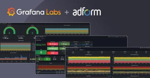
How to centralize thousands of data sources with Grafana: Inside Adform's observability system

Over the course of two decades, Adform grew from a dream between friends huddled in a basement to a leading advertising tech platform powering more than 25,000 clients worldwide. Success brought external accolades, but it also created the need for internal innovation to support the company’s continued growth. In 2018, Adform was still operating in startup mode, which meant developers and teams cherry-picked the tools that worked best for them.

Dashboard Design: Visualization Choices and Configurations

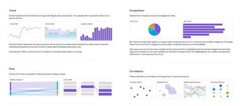
There are many visualization types and configurations available to choose from. In general, keep your visualizations as simple and straightforward as possible to avoid distraction and highlight only the most important information. If there is too much unnecessary information on the page it can be overwhelming and focus can be misdirected to unimportant details.