Dashboards
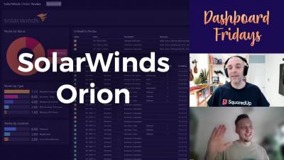
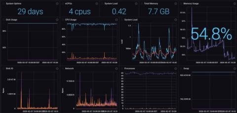
Dashboard Fridays: Sample SolarWinds Orion Nodes Dashboard
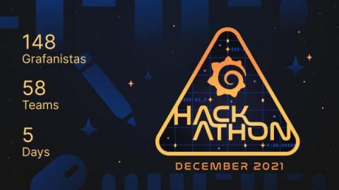
All about the Grafana Labs Hackathon 2.0
After the success of our first company-wide hackathon last June, we committed to hosting more hackathons each year. So in December, Grafana Labs invited the company to once again press pause on the daily grind and commit five days to our second hackathon. And the Grafanistas showed up: 148 staffers (almost 20% more than the last round) signed on for the week-long event that involved virtual brainstorming, collaborative coding, and creative presentations.
Virtual offsite ideas that work: How the Grafana Cloud team brings together 150 people online
It was a Wednesday in November, and we had just wrapped Grafana Labs' third virtual Grafana Cloud offsite of 2021. Outside my window, it was a dark and cold (8 degrees Celsius) night in Cologne (Köln), Germany. In Austin, Texas, it was early afternoon and headed for 80 degrees Fahrenheit. In Cape Town, South Africa, it was a windy and cool spring evening. And in Melbourne, Australia, our final speaker — who was up very early at 5 a.m. — was heading into a cool spring day.
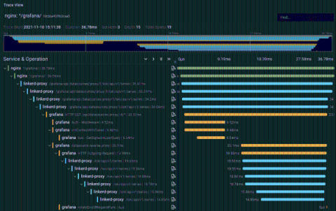
Configuring Grafana Tempo and Linkerd for distributed tracing
Anders Østhus is a DevOps Engineer on the Digital Tools team at Proactima AS, a consulting firm based in Norway that offers services and expertise in risk management, cybersecurity, healthcare, environmental solutions, and more. It can be difficult to orient yourself in the distributed tracing space, and getting all the parts of a tracing setup to play well with each other can be a bit tricky. But the benefits of tracing are undeniable.
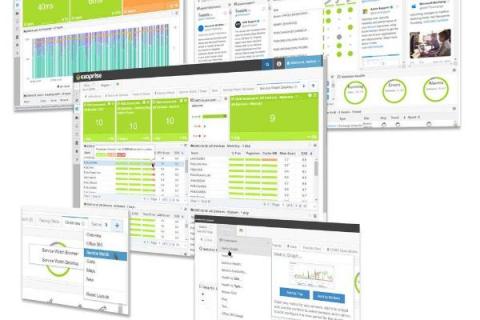
Top Dashboards For Remote Digital Employee Experience Monitoring
Your business is already operating in a hybrid model, isn’t it? Perhaps, you are deciding to become an entirely remote workforce. Whatever be the case, IT must support employees working from multiple locations and track remote digital employee experiences using real-time dashboards. In this article, we are going to cover three Digital Experience Monitoring dashboards to help your team identity and troubleshoot problems that your employees might face in their home environment.
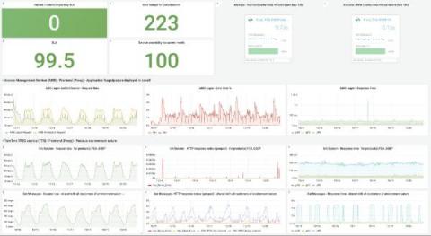
Reducing MTTR and tracking SLAs with Grafana Cloud
Attracting and retaining top developer talent is a No. 1 priority for a lot of companies these days, including location technology company TomTom. As both the builder of the world’s largest developer community and an employer of thousands of developers, TomTom is always looking for developer-friendly tools to help their employees feel productive, efficient, and inspired.
Building a React dashboard to visualize workflow and job events
Data visualization is the process of translating large data sets and metrics into charts, graphs, and other visuals. The resulting visual representation of data makes it easier to identify and share real-time trends, outliers, and new insights about the information represented in the data. Using CircleCI webhooks, we can gather data on workflow and job events. In this tutorial, I will lead you through the steps to create a React-based dashboard to visualize this data.
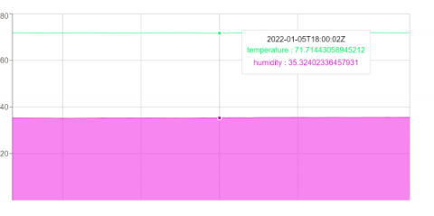
Recharts and InfluxDB Tutorial - Visualize IoT Sensor Data with ReactJS
In this tutorial, you will learn how to create a custom data visualization with ReactJS using the Recharts charting library to display time series data stored with InfluxDB. To do this you will store some real-time data being recorded by some IoT sensors which record the temperature, humidity, and carbon monoxide levels of a room.
5 Dashboard Design Best Practices
In an increasingly data-driven world, the ability to summarize and display data while making it easy to understand and actionable is more important than ever. Dashboards appear in all types of software with various approaches behind their design. Despite how they differ in appearance and the information they display, at a conceptual level all dashboards have the same goal and purpose.

